One label.
A family of packs.
Branding · Packaging design
Label design · packaging applications
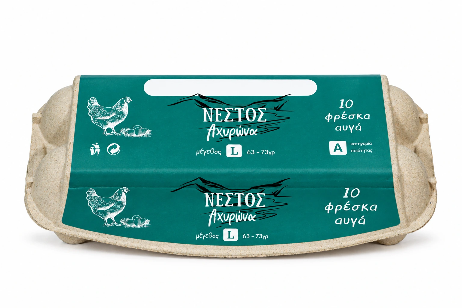
Nestos labels designed from the start: composition, name treatment, colour direction and information hierarchy.
The design gives the Nestos name, illustration and a recognisable colour field a clear role. Information is organised around them so the identity can extend to more than one pack.
The challenge
The pack needs to be identifiable with few elements while keeping the egg count, size and category clear. The label also needs to read from above and in front on curved, textured material.
Recognition
from the first view.
The hen and name form the label’s main axis. Dark linework and light text have distinct roles on the coloured surface. The name, count and size return on the front.
The reverse is
part of the design.
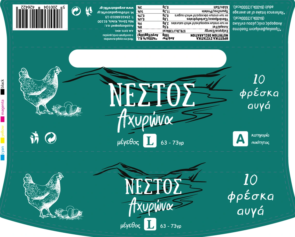
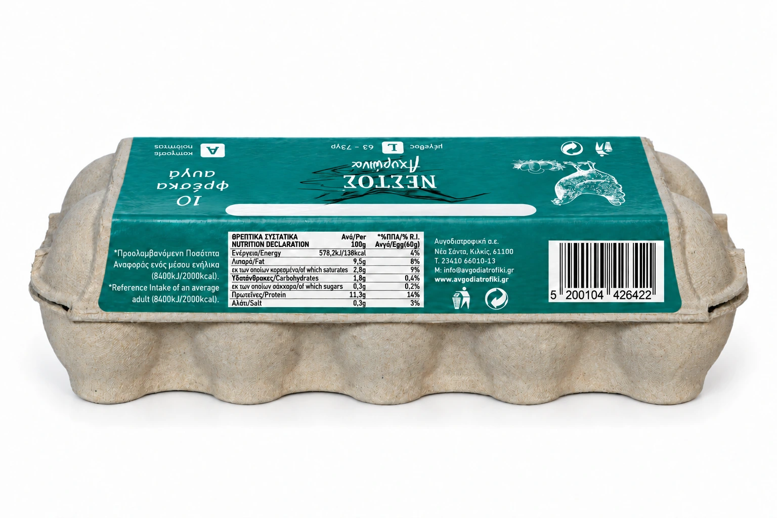
The dieline separates the main image from information that requires closer reading. Tables, codes and supporting details live in the actual artwork rather than a separate decorative presentation.
Shared logic.
Different versions.
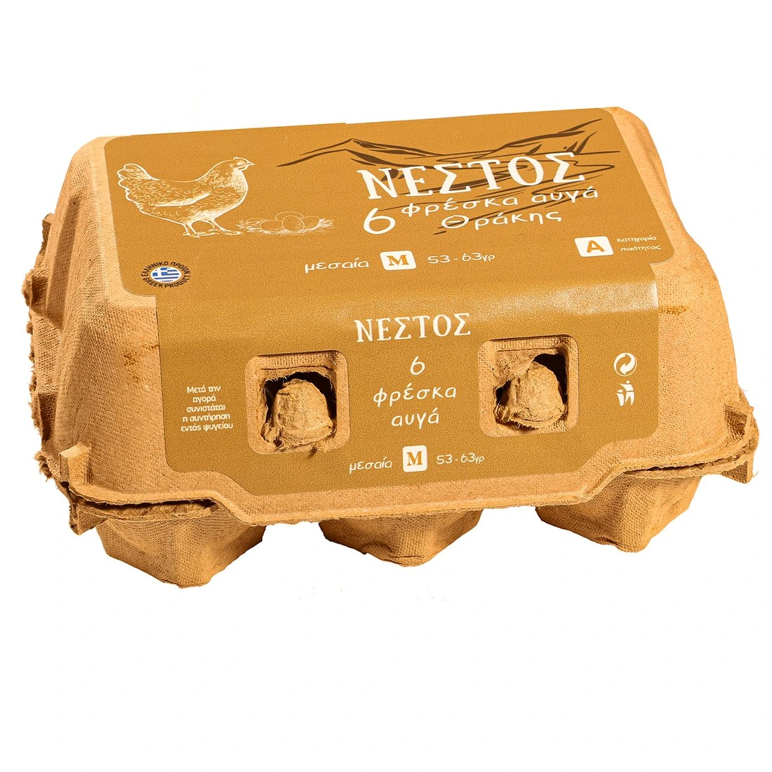
Six-packs and ten-packs have different space, colours and proportions. They are presented as distinct Nestos applications, rather than the same pack with a different caption.
The decisions
Identity alongside information
The name has visual weight while count and size keep a defined place on the main face.
Design across a dieline
The label is a surface that folds and wraps. Its top and front readings need continuity.
A shared basis for variants
Different packs retain the relationship between name, illustration and information.
Deliverables and status
- What was delivered
- An original label system with editable artwork and visual applications across different packs.
- What this means today
- Mockups are presentation images, not proof of manufacture or photorealistic 3D. Print acceptance and codes are checked in the production artwork, not certified by a portfolio thumbnail.